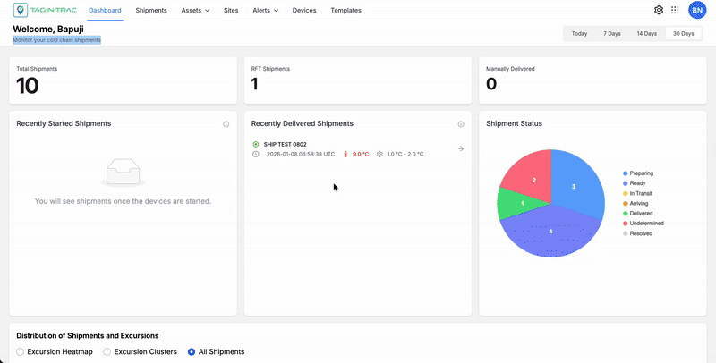
Dashboard
The Dashboard provides an at-a-glance summary of your cold chain operations, displaying real-time shipment activity, delivery performance, and overall shipment distribution. It enables users to track, analyze, and manage shipments effectively through interactive widgets and visual insights.
Cold-Chain Dashboard
Accessing the Dashboard
To open the dashboard:
- Sign-in to the Tag-N-Trac Relativity Platform.
- From the top navigation bar, select Dashboard.
- The dashboard view opens, displaying real-time shipment summaries and performance analytics.
Navigating the Dashboard
The dashboard is divided into multiple sections, each designed to give users quick insight into shipment status, progress, and global distribution.
Sections Overview
- Shipments Summary Tiles
- Recently Started Shipments
- Recently Delivered Shipments
- Shipment Status Summary
- Shipment Distribution Map
Each section includes widgets that users can select to view shipment-level details.
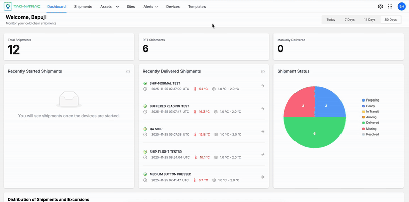
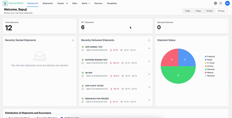
Shipments Summary Tiles
The Shipment Summary Tiles display categorized shipment data on the dashboard.
The tiles update automatically based on the selected time range (Today, 7 days, 14 days, or 30 days).
Use the tiles to:
- Review key shipment metrics
- Identify trends or anomalies in shipments
- View specific shipment categories for detailed analysis
Overview - Shipment Status Tiles
Each tile represents a shipment category and displays the count of total shipments for the selected time range. When you select a tile, the shipment list filters to show only records in that category.
Overview of Tiles by Shipment Status
Note: For details on viewing and interacting with shipment records, see Shipments List in the Shipments topic.
Available Categories
- Total Shipments — All shipments within the selected time range.
- Right First Time (RFT) Shipments — Shipments currently in transit.
- Manually Delivered — Shipments that experienced deviations or anomalies but were successfully delivered after the issues were resolved.
Notes:
- Tiles data updates in real time based on platform inputs and the selected duration.
- Tiles act as both summary indicators and dynamic filters, enabling both high-level overviews and detailed drill-downs.
Recently Started Shipments
The Recently Started Shipments panel lists shipments that have recently begun transit.
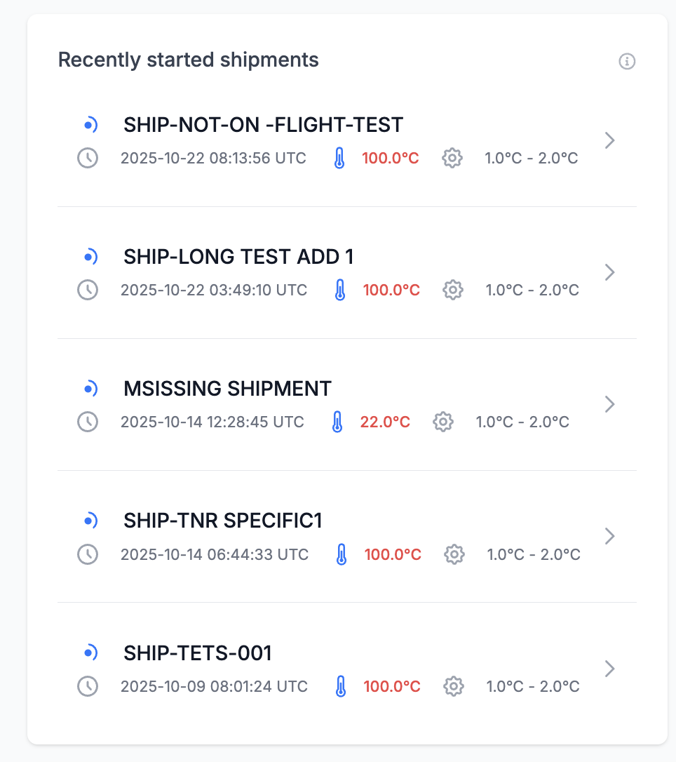
Recently Started Shipments
Each record displays:
- Shipment ID
- Start Date and Time (UTC)
- Current Temperature
- Configured Temperature Range
Use this panel to monitor newly initiated shipments and verify that temperature conditions remain within acceptable thresholds.
Key Features
- Shipment selection: Select a shipment to open the Shipment Details Page.
- Temperature indicators: Shipments that breach temperature limits are highlighted in red.
- Automatic updates: The panel updates automatically when shipments are initiated or their status changes.
Recently Delivered Shipments
The Recently Delivered Shipments panel lists shipments that have completed delivery.
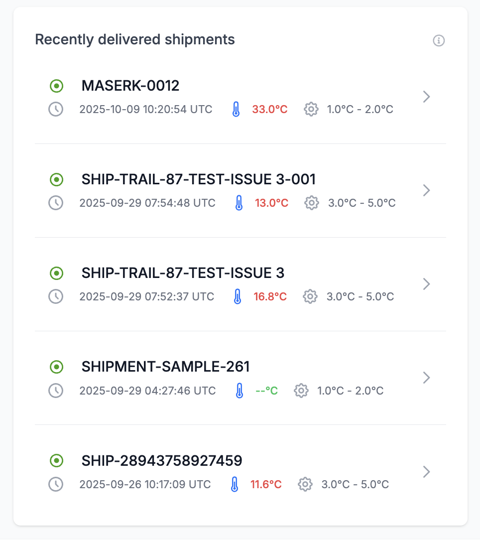
Recently Delivered Shipments
Each record includes:
- Shipment ID
- Delivery Timestamp (UTC)
- Final Recorded Temperature
- Allowed Temperature Range
Use this panel to validate shipment compliance and review temperature excursions that occurred during transit.
Key Features
- Interactive Rows: Select a shipment entry to access its full delivery record.
- Color Indicators: Excursions or deviations appear in red for immediate attention.
- Audit Trail Integration: Delivered shipment data is archived for compliance reporting.
Shipment Status Summary
The Shipment Status widget provides a high-level overview of all active and completed shipments, grouped by operational status.
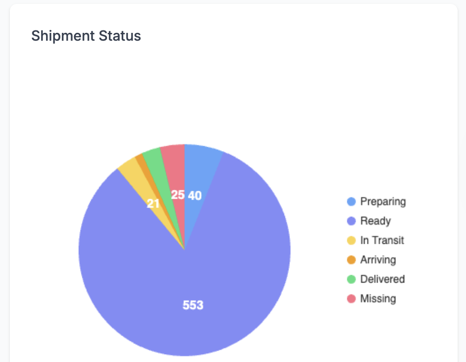
Shipment Status Summary
Status Categories
- Preparing: Shipments being processed or packed.
- Ready: Shipments awaiting dispatch.
- In Transit: Shipments currently en route.
- Arriving: Shipments nearing their destination.
- At Destination: Shipments that arrived at their destination but have not been opened.
- Delivered: Shipments that were successfully delivered.
- Missing: Shipments not located or untracked beyond expected timelines.
- Undetermined: Shipments with unknown or unclear status.
- Resolved: Shipments that experienced issues but were successfully delivered.
Features and Interaction
- Status filtering: Select a segment to filter the shipment list by status.
- Automatic updates: The chart updates automatically as shipment statuses change.
- Color-coded segments: Each status category uses a unique color.
Distribution of Shipments and Excursions
The Distribution of Shipments and Excursions widget displays shipments on a world map with excursion details. Use the widget to assess geographic coverage and shipment movement. Filter excursions by type: Excursion Heatmaps, Excursion Clusters, or All Shipments.
Distribution of Shipments and Excursions
Excursion Heatmaps
Use Excursion Heatmaps to view shipment data overlaid on the map. Filter by excursion types such as Light, Dwell, Shock, and Shipment Not On Flight to focus on specific anomalies.
Excursion Clusters
Select Excursion Clusters to view grouped shipment excursions on the map. Filter by excursion types such as Light, Dwell, Shock, and Shipment Not On Flight to focus on specific anomalies.
All Shipments
Choose All Shipments to view the live locations of all shipments on the map. Use map features to explore individual shipment details.
Map Features
- Real-Time Tracking: Shipments are updated live as new data is received from devices.
- Map / Satellite Views: Toggle between standard map and satellite imagery for different analysis perspectives.
- Zoom Controls: Adjust zoom to view shipment clusters at country, regional, or city levels.
- Interactive Markers: Click on a shipment marker to open detailed shipment information.
Map View Options
The Distribution of Excursions widget uses an interactive map to display the geographic distribution of excursion events. Users can switch between multiple map display modes to enhance visibility based on their analysis needs.
Map View: Terrain On/Off
- Terrain View (Enabled): Displays physical land features such as elevation changes, mountains, and valleys. This view helps users correlate excursion locations with terrain-related challenges.
- Terrain View (Disabled): Presents a simplified, flat map without terrain overlays, providing a cleaner visual when elevation is not a factor.
Satellite View: Labels On/Off
- Labels On: Shows geographic and political labels such as state names, country boundaries, and major cities on top of the satellite imagery. This helps users orient themselves while maintaining the satellite detail.
- Labels Off: Removes all overlaid text from the satellite view, offering an unobstructed image of the landscape, ideal for visual analysis of rural or natural areas.
Map Controls
- Zoom In (+) / Zoom Out (–): Located in the bottom-right corner, these buttons allow users to zoom in and out of the map to examine excursions at different levels of detail.
- Pegman (👤): The yellow figure (also called the Pegman) activates Google Street View. Drag and drop Pegman onto a street or road segment to access a ground-level panoramic view of that location, enabling detailed inspection of excursion zones.
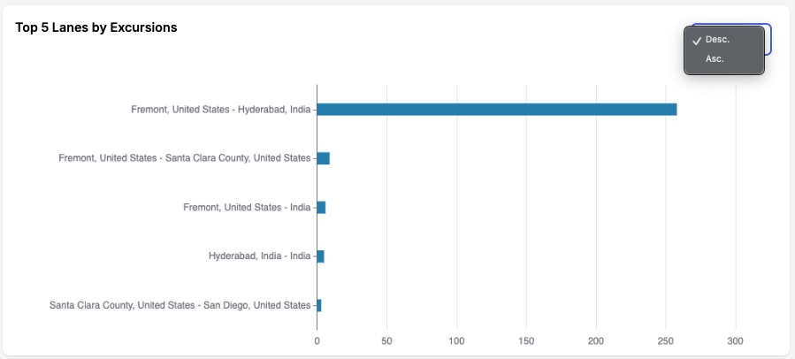
Top 5 Lanes by Excursions
The Top 5 Lanes by Excursions widget displays a horizontal bar chart that ranks shipping lanes by their excursion counts.
Use this widget to identify lanes with the highest exception activity so you can investigate root causes and prioritize corrective actions.
Top 5 Lanes by Excursions
How to Read the Chart
Each bar represents a shipping lane.
- X-axis: Number of excursions recorded on the lane
- Y-axis: Lane names, ordered by excursion count
- Use the Desc/Asc toggle to change the sort order
Note: The widget displays up to five lanes. If fewer lanes qualify, only the available lanes appear.
Example
- Fremont, United States → Hyderabad, India: approximately 250+ excursions.
This example shows that excursions are heavily concentrated on the Fremont (USA) → Hyderabad (India) route.
Using the Widget
Use the chart to:
- Prioritize corrective action on lanes with the highest excursion counts
- Adjust routing strategies by evaluating options such as carriers, handoffs, or alternative routes.
- Monitor SLA performance and align alert thresholds with top-risk lanes
- Select a bar to view detailed excursion information about the selected lane
- Track performance over time to confirm improvements after corrective action
Best Practices
To make the most of the dashboard features:
- Review Recently Started Shipments daily to ensure compliance and detect early temperature deviations.
- Check Recently Delivered Shipments to confirm successful delivery and identify trends in temperature excursions.
- Use the Shipment Status Summary pie chart to assess operational load and delivery progress quickly.
- Explore the Distribution Map to monitor regional activity and identify logistical bottlenecks or route patterns.
Tip: Combine dashboard views with alert notifications for proactive cold chain management and compliance assurance.
Summary
The Dashboard serves as a unified command center for monitoring all shipments in your cold chain network.
Its interactive, real-time interface enables users to:
- Track live shipment progress
- Identify exceptions and risks early
- Analyze operational performance
- Improve decision-making with visual insights
Updated 4 months ago