Dashboard
This section provides an overview of the Shipment Tracking dashboard, describing its key components, interactive visualizations, and filtering options that support monitoring shipment performance, excursion insights, and delivery trends.
The Dashboard displays an overview of all shipment statistics and operational insights. It is organized into parts to help you track and handle shipments more effectively.
Accessing the Shipment Dashboard
To open the shipment dashboard:
- Sign in to the platform.
- From the top menu bar, select Dashboard.
- The dashboard view opens.
Navigating the Shipment Dashboard
Shipment Dashboard
The shipment dashboard is divided into the following sections:
- Shipments Summary Widgets
- Shipment Status Details
- Top 5 Shipments with Excursions
- Excursion Insights
- Geographical Distribution of Excursions for various parameters
- In-transit by Region
- Delivery Performance Insights
- Top 5 Most Used Templates
The shipment dashboard includes clickable widgets that direct you to more detailed views:
- Bar Charts: Offers a breakdown of shipments with excursion properties and, when clicked, opens shipment-specific details with the applied filter.
- Map View: Displays real-time geo-locations and allows toggling between heat-map and clustered excursion types to view the distribution of excursions.
Filtering Shipments Data by Date Range
You can filter shipment data to show records from the past 7 days, 14 days, or 30 days using the duration range selector.
After you select a date range:
- All shipment data on the page updates.
- Dashboard widgets refresh to reflect the selected time frame.
Use this feature to focus on the most relevant data for your operational or reporting needs.
To filter shipment data:
- Locate the Time Range Selector in the top-right corner of the shipment data panel.
- Select one of the following options:
- 7 Days — Shows shipments from the last 7 days.
- 14 Days — Shows shipments from the last 14 days.
- 30 Days — Shows shipments from the last 30 days.
- The shipment data and dashboard widgets update automatically to reflect your selection.
Notes:
- The selected filter remains active until you change it or refresh the page.
- Data refreshes in real time based on the selected time frame.
Best Practices
- Use 7 days for daily monitoring or short-term trend analysis.
- Use 14 days for biweekly performance reviews or follow-ups on unresolved deliveries.
- Use 30 days for monthly summaries, audits, or reporting cycles.
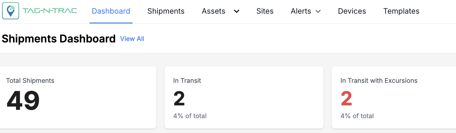
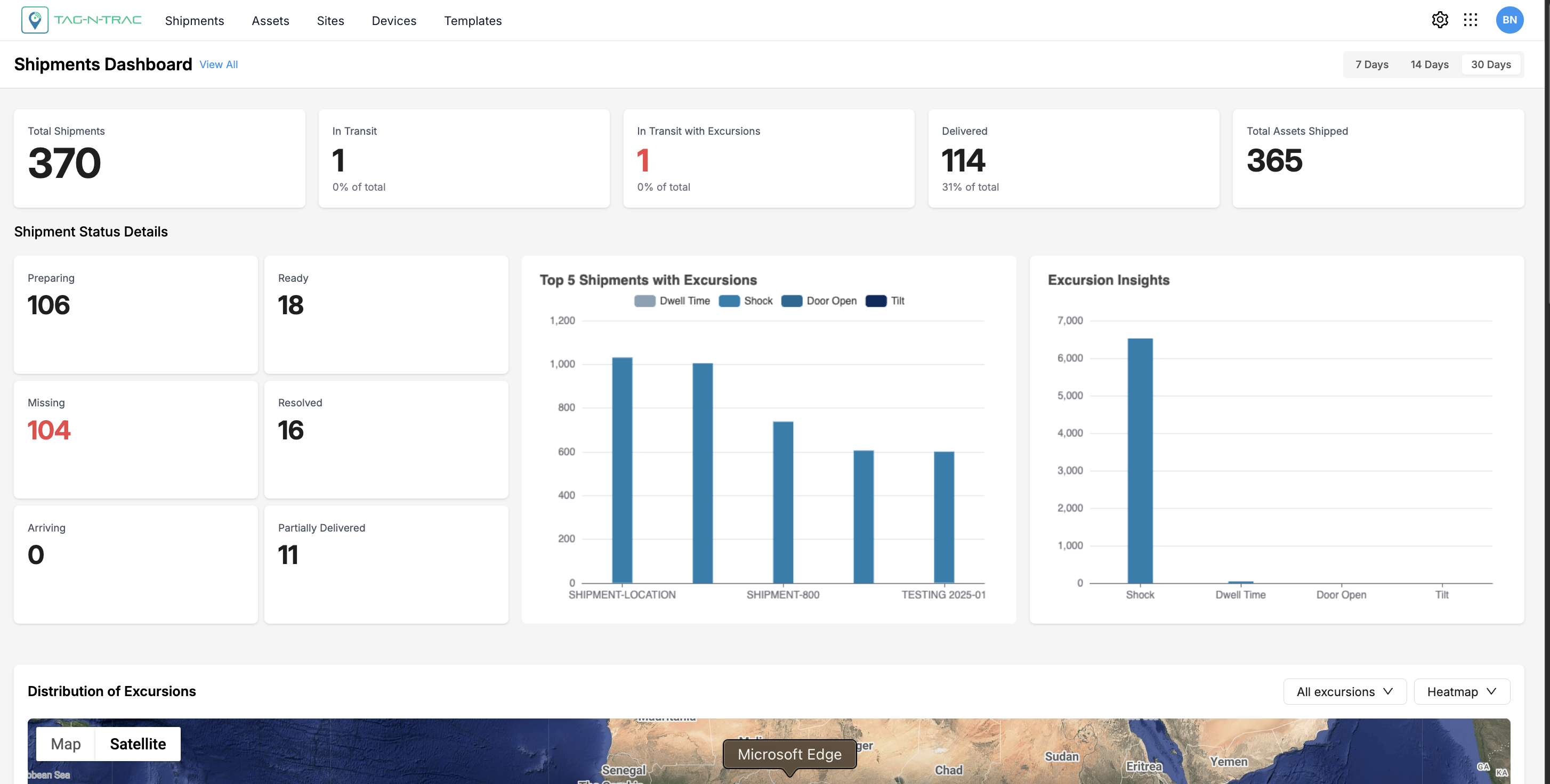
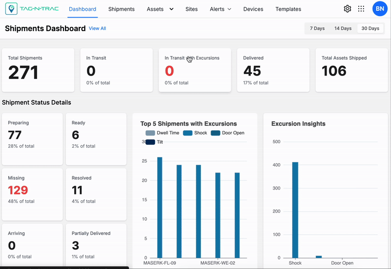
Shipments Summary Widgets
The Shipment Summary Widgets provide a categorized view of your shipment data directly on the dashboard.
These widgets are interactive and automatically update based on the selected time range (7, 14, or 30 days).
Use these widgets to:
- Quickly review key shipment metrics.
- Identify trends or anomalies in your shipments.
- Examine specific shipment categories for detailed analysis.
Shipments Overview
View All
Click View All to display the full list of shipments on the platform, regardless of the selected date range.
Note: For details on viewing and interacting with shipment records, see Shipments List in the Shipments topic.
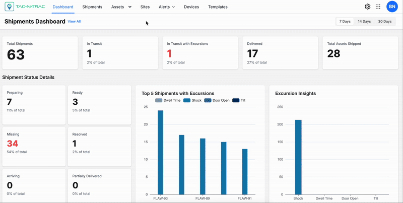
Overview of Tiles by Shipment Status
Each tile represents a shipment category and displays the count and percentage of total shipments for the selected time range. Clicking a widget filters the shipment list to show only records in that category.
Note: For details on viewing and interacting with shipment records, see Shipments List in the Shipments topic.
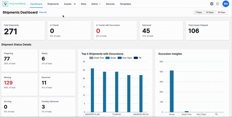
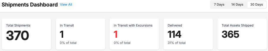
Available Categories
- Total Shipments — All shipments within the selected time range.
- In Transit — Shipments currently in transit.
- In Transit with Excursions — Shipments that experienced deviations or anomalies.
- Delivered — Shipments successfully delivered.
- Total Assets Shipped — Assets moved across all shipments.
Best Practices
- Use In Transit with Excursions to quickly identify shipments that require attention.
- Use Delivered to verify delivery performance for the selected period.
- Compare widget values across time frames to spot trends or irregularities.
Notes:
- Widget data updates in real time based on platform inputs and the selected duration.
- Widgets act as both summary indicators and dynamic filters, enabling both high-level overviews and detailed drill-downs.
Shipment Status Details
These tiles offer a breakdown of shipments by their status. Selecting a tile filters and displays the list of shipments that belong to the selected category.
Note: For more details about viewing and interacting with shipment records, see the Shipments List section in the Shipments topic.
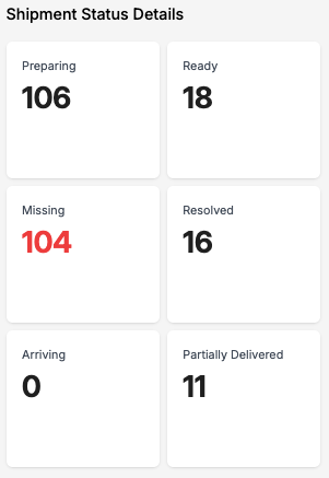
Status Insights
Status Categories
Shipment status categories provide real-time visibility of the current state of each shipment throughout its lifecycle. These statuses are automatically assigned based on system logic, geofence triggers, and tracking device feedback. Understanding these categories helps users monitor progress, identify issues, and take appropriate action.
Note: Status categories are determined by predefined geofence configurations and the properties of the tracking devices used during shipment or asset creation. For more information, refer to the device's user manual or product brochure.
- Preparing: The shipment is currently being processed and packed.
- Ready: The shipment is fully packed and ready for dispatch.
- Missing: The shipment cannot be located or has not arrived as expected.
- Resolved: Previously reported issues with the shipment have been addressed and closed.
- Arriving: The shipment is approaching its destination but has not yet been delivered.
- Partially Delivered: A portion of the shipment has been delivered; the remaining items are still in transit, delayed, or missing.
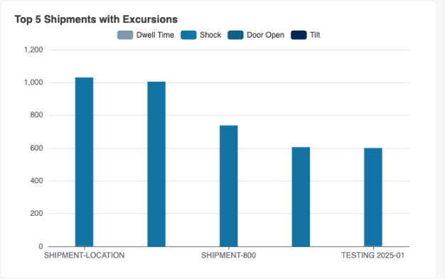
Top 5 Shipments Experiencing Most Excursions
The Top 5 Shipments with Excursions widget displays a visual breakdown of the five shipments that have experienced the highest number of exceptions or excursions. This bar chart helps identify which shipments require attention based on specific condition breaches.
Each bar represents a shipment, and the stacked segments indicate the type and frequency of excursion events encountered during transit. This allows users to quickly assess risk factors affecting shipment quality or compliance.
Note: For more information on shipment's details page, refer to Shipment Details Page section in Shipments topic.
Top 5 Shipments Experiencing Most Excursions
How to Interact with the Widget
- Hover over each segment of a bar to view detailed excursion counts for that shipment.
- Click any segment in the legend to toggle that excursion category on or off. This enables you to isolate or compare specific types of events.
- Use combination clicks to filter the chart and analyze selected categories together (for example, only Shock and Tilt).
This widget is useful for:
- Prioritizing shipments that may need investigation or corrective action.
- Comparing excursion types across different shipments.
- Identifying recurring excursion patterns by category.
Excursion Categories
The bar chart categorizes excursions into the following types. Understanding these helps interpret the chart accurately:
- Dwell Time: The shipment remained stationary beyond the acceptable threshold, indicating a possible delay or deviation from route expectations.
- Shock: The shipment was exposed to abrupt force or vibration, potentially damaging sensitive goods.
- Door Open: The container or vehicle was opened during transit outside of authorized checkpoints.
- Tilt: The shipment experienced angular displacement beyond the permitted range, which could indicate mishandling.
Note: Click on any excursion category in the legend to toggle its visibility—click once to hide or show a category, and use combinations of clicks to view and compare specific excursion types across shipments. This helps focus analysis by visually filtering out less relevant data.
Excursion Insights
The Excursion Insights widget provides a visual summary of the frequency of excursion events detected across all shipments. This bar chart enables users to assess the most common types of excursions and evaluate overall shipment risk and compliance at a glance.
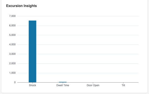
Excursion Insights
Each bar represents the total number of excursions recorded under a specific category. This helps logistics managers prioritize corrective actions and identify patterns that may impact shipment quality or security.
How to Interact with the Widget
- Click on any bar in the chart to open the Shipments List page filtered by the selected excursion type.
- Use this view to investigate individual shipment records that contributed to the excursion count.
This widget is useful for:
- Identifying the most frequent excursion types across all active shipments.
- Highlighting potential risk areas requiring further operational or packaging improvements.
- Quickly accessing filtered data for targeted analysis.
Excursion Categories
- Shock: A sudden or forceful impact affecting a shipment or asset, such as collisions, drops, or excessive vibration.
- Dwell Time: Time spent stationary at a location beyond the acceptable limit, which may signal delays or unplanned stops.
- Door Open: Occurs when a shipment’s compartment or storage unit is opened unexpectedly, potentially compromising the internal environment or indicating a security breach. This is typically detected via light sensor data.
- Tilt: Indicates that a shipment or asset has tilted beyond the permissible threshold, which can occur due to improper handling or unstable loading conditions.
Note: For more information about excursion rules, thresholds, and configuration settings, refer to the Rules section in the Settings module.
Geographical Distribution of Shipments and Excursions
The Distribution of Shipments and Excursions widget displays your shipments on a world map, along with excursion details. It helps you quickly assess geographic coverage and shipment movement. You can filter excursions by type: Excursion Heatmaps, Excursion Clusters, or All Shipments.
Excursion Heatmaps
Use Excursion Heatmaps to view shipment data overlaid on the map. Filter by excursion types such as Shock, Dwell Time, Door Open, and All to focus on specific anomalies.
Excursion Clusters
Select Excursion Clusters to view grouped shipment excursions on the map. Filter by excursion types such as Shock, Dwell Time, Door Open, and All to focus on specific anomalies.
All Shipments
Choose All Shipments to view the live locations of all shipments on the map. Use map features to explore individual shipment details.
Map Features
- Real-Time Tracking: Shipments are updated live as new data is received from devices.
- Map / Satellite Views: Toggle between standard map and satellite imagery for different analysis perspectives.
- Zoom Controls: Adjust zoom to view shipment clusters at country, regional, or city levels.
- Interactive Markers: Click on a shipment marker to open detailed shipment information.
Map View Options
The Distribution of Excursions widget uses an interactive map to display the geographic distribution of excursion events. Users can switch between multiple map display modes to enhance visibility based on their analysis needs.
Map View: Terrain On/Off
- Terrain View (Enabled): Displays physical land features such as elevation changes, mountains, and valleys. This view helps users correlate excursion locations with terrain-related challenges.
- Terrain View (Disabled): Presents a simplified, flat map without terrain overlays, providing a cleaner visual when elevation is not a factor.
Satellite View: Labels On/Off
- Labels On: Shows geographic and political labels such as state names, country boundaries, and major cities on top of the satellite imagery. This helps users orient themselves while maintaining the satellite detail.
- Labels Off: Removes all overlaid text from the satellite view, offering an unobstructed image of the landscape, ideal for visual analysis of rural or natural areas.
Map Controls
- Zoom In (+) / Zoom Out (–): Located in the bottom-right corner, these buttons allow users to zoom in and out of the map to examine excursions at different levels of detail.
- Pegman (👤): The yellow figure (also called the Pegman) activates Google Street View. Drag and drop Pegman onto a street or road segment to access a ground-level panoramic view of that location, enabling detailed inspection of excursion zones.
Tip: Use the Heat map or Cluster view toggles in the top-right to adjust how excursions are visualized—either by intensity zones or grouped pins.
Excursion Categories
Each excursion category represents a specific type of event or condition breach that may impact the safety, security, or quality of a shipment. These categories help users filter, analyze, and take action based on real-time excursion data.
- All Excursions: Includes all recorded excursion events across categories (Shock, Dwell Time, Door Open, etc.). Use this filter to view a consolidated list of all affected shipments.
- Dwell Time: Indicates that a shipment has remained stationary at a location longer than the predefined time threshold, suggesting possible delays or route deviations.
- Shock: Refers to sudden impact or excessive vibration experienced by a shipment, potentially affecting sensitive equipment or goods.
- Door Open: Triggered when a container, package, or compartment is opened unexpectedly, which could compromise environmental conditions or signal unauthorized access.
In Transit by Region
Delivery Performance Insights
The Delivery Performance Insights widget presents a horizontal bar chart that visualizes the average delivery duration in days across defined distance ranges. This tool enables users to assess delivery efficiency and identify trends or anomalies that may impact performance.
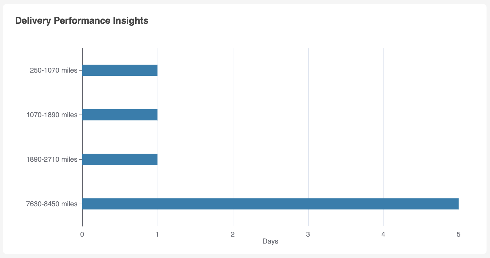
Delivery Performance Insights
Understanding the Chart
Each bar corresponds to a specific mileage range and represents the average number of days it takes to complete deliveries within that range. The X-axis shows time (in days), while the Y-axis lists the mileage intervals.
Mileage Ranges and Example Averages
- 250–1070 miles: ~1 day
- 1070–1890 miles: ~1 day
- 1890–2710 miles: ~1 day
- 7630–8450 miles: ~5 days
These values indicate consistent performance for mid-range distances and a proportional increase for long-haul shipments.
How to Use This Widget
- Monitor delivery consistency: Confirm whether similar distances yield consistent delivery durations.
- Identify inefficiencies: A longer duration for shorter ranges may indicate a routing issue, resource bottleneck, or excursion-related delay.
- Benchmark performance: Use the data to set service level expectations or contractual baselines.
- Support data-driven decisions: Pair insights with excursion metrics to evaluate whether delays are tied to events such as dwell time or route conditions.
Tips
- Combine this insight with the Distribution of Excursions widget to investigate if certain routes or regions contribute to delivery delays.
- Use historical performance data to establish thresholds or triggers for alerts.
Top 5 Most Used Templates
The Top 5 Most Used Templates widget displays a horizontal bar chart representing the five most frequently used document or workflow templates in the system. This visualization enables users and administrators to quickly assess usage trends and identify which templates are in highest operational demand.
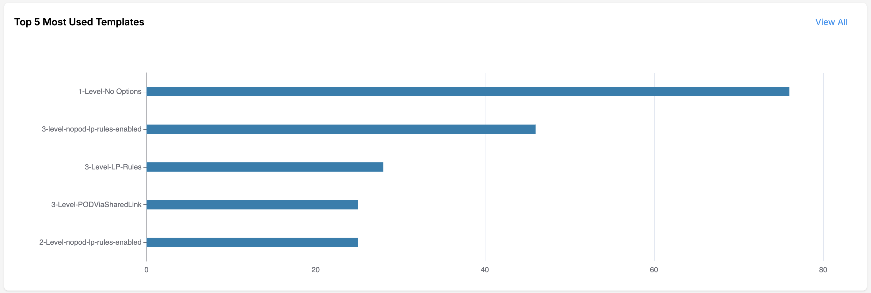
Top 5 Most Used Templates
Understanding the Chart
Each horizontal bar corresponds to a specific template. The X-axis represents the number of times a template has been used, while the Y-axis lists the template names in descending order of frequency.
Example Display (as shown in the above figure)
- 1-Level-No Options: ~75 uses
- 3-level-nopod-lp-rules-enabled: ~45 uses
- 3-Level-LP-Rules: ~30 uses
- 3-Level-PODViaSharedLink: ~28 uses
- 2-Level-nopod-lp-rules-enabled: ~26 uses
This output indicates a significant preference for simplified, single-level templates without optional parameters, followed by multi-level templates with specific rule configurations.
How to Use This Widget
- Monitor template adoption: Gain insights into user preferences and operational trends across departments or workflows.
- Optimize template availability: Identify popular templates for duplication, enhancement, or standardization across the organization.
- Drive training and support: Direct onboarding or training initiatives based on frequently used configurations.
- Click “View All”: To see additional templates beyond the top five, select the View All link in the top-right corner.
Tips
- Use in combination with usage analytics or role-based filters to explore trends by user group or access level.
- If a rarely used template appears among the top five, investigate potential overuse or misuse in certain contexts.
Best Practices
The following steps will help you navigate and utilize the dashboard effectively. By exploring various data visualizations and interactive features, you can uncover key insights into shipment statuses, excursion trends, and geographical distributions. Follow these steps to make the most of the dashboard’s capabilities.
- Review shipment data in the Shipments Overview section.
- Click on pie chart slices to explore shipment statuses.
- Use the bar chart under Excursion Insights to view detailed excursion properties.
- Examine the Top 5 Shipments bar chart for excursion-prone shipments.
- Interact with the map to explore excursion distributions in real time.
- Toggle between heat map and excursion types for additional insights.
Updated 7 months ago